Media & Rep
Friday 4th November
Media Language and Representations
L/O: to develop the language of media analysis

What is this? Album cover
What is the genre? Pop Rock
Who is the target audience? 14-21
How is the artist represented? They're represented as bold and strong, but still has feminine traits. We can also see that the artist is not one to follow the crowd.
What told you these? The way she is standing and the pose she is making tells me these things. What tells me that she is not one to follow the crowd is the fact that she has an exclamation mark in her name that we can see in the top let hand side of the screen.

The denotative features in both of these covers are, in the royalty album cover see can see a shirtless man covered in tattoos holding a baby we can also see he has a lot of jewellery on. Whereas in the born this way song cover has a women morphed into a bike with a black background. The connotations of the first one are that he is quite a wealthy man as the jewellery he is wearing seems to be diamond or if not some sort of very shiny rock which shows its expensive. we can also assume he is a father of this child he is holding onto the cover giving connotations of father and daughter love, Also we can see the child is also shirtless possibly telling us that they're just like their father in this image. The mass amounts of tattoos can show to us that he is a hip hop rapper as that if is a very crucial feature along with the expensive jewellery to make these assumptions. But the cover counters those connotations of the hip hop album cover by adding their child into it because we don't usually see feelings of love be portrayed in that type of genre. However this differs in the Born this way song cover as it is a lot more convention and doesn't really follow genre conventions of any of the genres, although we can see that with the bike in the image we can assume it may be a rock album of some sort, along with the messy hair and makeup we can almost definitely assume this is a rock but yet again it isn't shown clearly what it actually is as it is a very confusing cover with her body turning into the bike or the bike turning into a human head.
Wednesday 9th November 2022
Semiotics
L/O: to understand the terminology and theory needed to analyse music videos
Camera work in the Hannibal Lecter scene.
The close up on his face while he smiles as we see the women get closer and closer to the glass gives the audience an eery feeling as if something is not quite right. Us knowing the backstory to what this man did also adds to the scary eery feeling we may feel it makes it seem that the women is not safe around this man even though we can clearly see there is a protective layer of glass blocking them two. Also the initial full body shot we see of the man is also very strange and not very normal for a human being which creates feeling of yet again thrilling eeriness and tension.
HOMEWORK
I agree that the James Bond films are constructed for a 17-35 year old male audience range because of the way different people are presented. For example in every bind movie even still in the recent years and the past ones from 1960’s have portrayed James Bond as a powerful leading male character who can get whatever he pleases, we always see him with a female companion in every movie than he quickly brushes off after leading them to his room and getting what he wants from then when work needs to be done. This obviously portrays women in a bad light because it shows weakness and the feeling of needing to be wanted. This then links back to the male gaze and makes appeal of what they want to see in a movie that they go and watch. Also another reason why I believe that the target audience would be males aged 17-35 is because of how James Bond is portrayed, for example when he gets into a fight in a movie he always returns unscathed and not fazed by what has just occurred, and gracefully sorts out his suit to carry on with what he needs to do. This then could create almost a role model figure for the target audience as if they’re watching and learning while doing so on how to become like James Bond.
Friday 11th November 2022
Analyse
L/O: to practise using the terminology and theory needed to analyse music videos.
Music Video - SSGKobe, MIA
The camera work in this video portrays what the artist is singing about, for example the use of a dutch tilt which speeds up and then zooms out could portray how he is feeling inside his own head. We know this because of what he says while the camera is spinning, in my head they asking where I've been, I've been away. this further proves why the use of a dutch tilt was used here and backs up my point that it is portraying what is going on inside his head. We also then see closely after a close up shot of him pushed up against what seems to be glass or nothing and we are seeing it from an underneath point of view. The intertextuality is used to bing in people that may have recognised that and can then connect with the artist on that level of enjoying the same things he likes for example his use of being spiderman and shooting webs at the camera is a moment where he tries to connect with his audience. we also see this with the shot of him on the ledge and the big green moon behind him which reminds me of the nightmare before christmas movie poster. The music video also follow traditional conventions of a music video because the main focus of the video is the artist that sings the song and it is a performance video rather than a narrative video. There is little to no gender representations in this music video. It consist of men and one stereotypical attractive women who is on the main artists side, walking alongside him and we only ever see her holding hands with the artist. We also see the general conventions of a hip hop music video for example the group of being jumping around as if they're dancing to the song is a traditionally hip hop convention when it comes to the hip hop genre. we also see the video consisting of mainly african americans who is also most of the time who these videos are target towards and who makes them.
Wednesday 16th November 2022
Analysis
L/O: to practise using the terminology and theory needed to analyse music videos.
ADDED TO PREVIOUS IN PINK COLOUR.
Friday 18th November 2022
The message of this video is about being yourself and it links back to the song because he is one of a kind and not like everyone else. The genre of the song is hip hop, we know this because of the constant switching of scenery and the graphic editing added over the top to emphasis what going on in the video. The artist is represented as the only person in his video, in almost every shot it is just him in focus. It shows everyone around him in a main city centre does not care about him and what he is doing and just continues on with his day. There is little to no representation of gender in this video, there is just one male and that is the main artist but other than that we don't see anyone else
Wednesday 23rd November 2022
List A -
Song - Emeli Sande - Heaven
Genre - Classic Soul
Release date - 2011
Summary of song meaning -
List B -
Song - David Guetta - Titanium
Genre - Pop
Release date - November 26th 2011
Description of what happens in the video - A boy destroys a school with supernatural powers and scares the police and the people in the building
Friday 25th November 2022
L/O: To explore the purpose, form and conventions of music videos
Heaven -
Use of mid shots and close ups
Large range of angles
Some establishing shot in some areas of the video
It is cut to the beat and tempo of the song
small use of slow motion used
colour grading is very dull and dark
Props create realism
Natural lighting
Wednesday 30th November

very feminine,
pink hair,
makeup,
revealing/showing skin,
HEAVEN EMILI SANDE
Where Was it filmed?
Bethnal green
Who directed it?
Jake Nava
How was it released?
via digital download and 7" vinyl
Can you find ant quotes or press releases from either the artist or the record label about the video and what it is supposed to be about?
Sande is presented as quite religious in the heaven music because of what she is wearing and the camera angles that are used. we see one camera angle where she is looking up into the sky and pointing while the glare of the sun is shining through almost painting her as an angle in this video. The low angle also tells us that she has some sort of importance. We also know she is represented as religious through the use of mise en scene and what is in the video itself. The man i the background carrying the big cross, the angle wings back tattoo, the dangling cross on the screen on its own, these are all symbols of religion in the heaven music video which tell us that she may be religious or has some beliefs in what she is singing about
Friday 2nd December 2022
camera angle above the hospital bed looking at her
wearing hospital robe
hear the beeping of the heart beat
stumbling through the hospital in a robe
very dull grey
leaves hospital through bright white door
into a flower field wearing a flowy white summer dress
sun glare
hospital is a metaphor for her mind, she overcomes all her problems
escapes the loop of drugs and the constant cycle
binary oppositions
ends with her laying down in the field on a bed of flowers, circular structure
Dutch tilt fade to black
Street life had been represented as very black and white and as it is represented as this horrible thing or a very good thing. We see that some people on the street despite their current situation seem to be happy or tolerant of how they live this shows the audience through the use of Mise en scene how different people are represented in this music video. Whereas in other image stills for example the wide shot of the children sitting around doing nothing on the sidewalk, we see some very unhappy people who look as if they no longer want to be there so we can see both sides of how street life is where this was filmed (Bethnal Green) The artist on the other hand has been represented to be as if she is one of them and knows what they are going through but I believe she is represented to be almost like their guardian angel sent from heaven to help them out on the street. I also believe certain camera angel shots like the very common use of a low angel shot reenforces this idea further. We also see various ages in this video and get to see how they are represented differently, there is a lot of younger generation representation but a lack of the older generation yet when an older person is on the screen we do see that they are represented in a good way, looking up at the light as if Emeli is their angel of some sort as we see her predominantly from these low angle shots which shows us that she is the main character.
We also see the bad side of street life within this music video, for example when we see the children standing looking directly at the camera it almost makes you feel sorry for them because they have to live in this area where it is not a very nice place to live.
Wednesday 7th December 2022
Who directed the titanium video?
David Wilson
What is the message behind titanium video?
A boy with supernatural powers who is. persecuted and pursued by authority figures for being different.
What was going on in 2010/11 in the UK?
London Riots
How does the camerawork reflect the child's view of the world?
the camera work
How does the MES show the setting to be early 80's American suburbia?
It has classic american 80's things such as the TV being a box TV and the things the coppers are wearing, the brown shirts and the brown coats shows the 80's very well in this music video.
How authority is shown?
Friday 9th December 2022
Intertextuality in Titanium
Titanium links back to super 8 movie through the being the same actor that played in the 2011 movie. Idea of reaction to the unknown/supernatural
It has common Spielberg tropes, often children being the protagonists.
Links back to ET with the time it was based in and the traditional boy on a bike.
1 person vs army/authority (underdog)
Titanium has many intertextual references in it, for example the links to Spielberg and his common traits in movies, the classic one is the main protagonist being a child and we see the world from his point of view. We see this heavily in the titanium video because the main character in it is in fact a child but not only is he a child but he is an ordinary child with supernatural powers. Which then again links back to Spielberg because of his movies that he directed where it tends to be ordinary people in a supernatural town/place, but David Guetta's titanium has turned this on its head by making the ordinary people the ones with the supernatural powers. We can also see obvious links back to older movies like the 1969 movie Superargo, we initially see the poster behind the TV screen
Wednesday 14th December 2022

Wednesday 4th January 2023
The music video for titanium very clearly shows individualism as we see the boy completely by himself metaphorically and literally, we don't see any parents or school peers showing he is alone and an individual in this video. And we can also see patriarchy as the other ideology in this music video because we see that everyone above the boy has authority over him for example the police & the army in this music video.
Toderov's narrative links to ideologies
Wednesday 11th January 2023
L:O to understand the purpose of advertising and the language used to analyse texts

Black and Red colour palette makes it seem sinister, The facial expression she is pulling is showing us that this is a serious brand and makes it seem as though the people who may choose to buy this will be very serious and look like the model shown in the main image. We can also see from the fact that there is very minimal typeface that Dior do not want to cover too much of the main image and they want to try and keep it as simple as possible, but when typeface is used we can see that other than the main headline it is a golden colour which gives us connotations of wealthiness due to gold being an expensive item.


LYNX -
The overall message of the lynx advert is that if you wear lynx you will be like jay from the inbetweeners and attract lots of people. we can see this through the prop that the look alike is holding which is supposed to show us how many women he supposedly has gotten with.We can also see this through the facial expression he is pulling and the fact that he seems proud of what he is holding. We can also see that they are trying to portray this image that lynx attracts by putting that slogan "the Lynx Effect" this shows us that by using lynx you automatically gain an effect, which is a marketing tactic they have chosen to use to try and sell their product.
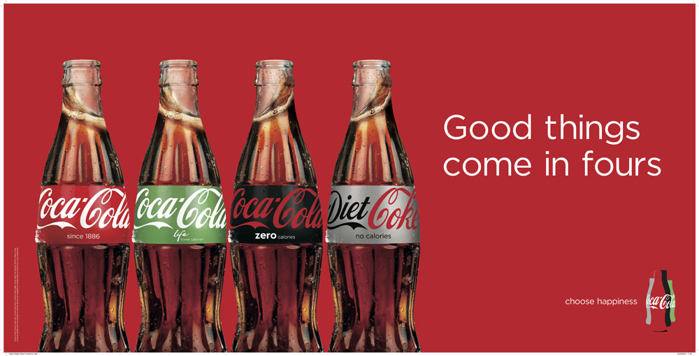
COCA-COLA -
CHARITY -
The overall message of this advert is to raise awareness of domestic violence and sexual assault, we can see this through the text on the screen at the bottom which states this quite clearly
Friday 13th January 2023
L/O: to explore how representations are constructed in advertising.
Wednesday 18th January 2022
Preferred Reading - accepting the initial meaning and buying the product
Negotiated Reading - accepting the initial meaning but do not buy the product
Oppositional Reading - reject the initial meaning and do not buy.
Exam Set Texts
Old Spice -
Founded in 1934
Originally made for older men
Changed their branding in 2010/11 to target all ages
Brand values: “Provide branded products and services of superior quality and value that improve the lives of the world's consumers, now and for generations to come.”
Old spice's brand ambassador is Isaiah Mustafa
Lucozade Sport -
Shelter -
Friday 20th January 2023
L/O: To analyse context and codes & conventions in the old spice advert
The old spice branding has changed a lot since 1960, they have become more self aware. Initially their way of branding stuck to 2 very traditional views, Being a manly muscley active man and attracting women were they 2 big focal points when making an advert for old spice, for example we can see that in the 1960's we see they had women pose is provocative ways with the caption saying, Girls like it. This has obviously changed a lot since then and old spice have actively turned their brand image around in 2010 by making this big comeback with various different ads and instead of traditional values they have now changed them to appeal more to the younger generations not just the older people who may have bought it back in 1960-1980. Despite them having changed their branding techniques we can still see that in most of the adverts they have stuck to the idea of a muscley man who is very active, we know this because we can see it in the video advert that came out in 2010 where he is seeing doing many different activities such as riding a motorbike, jumping off of a water fall and in the kitchen with tool building and crafting in it. We also see that in all of the adverts that he is shirtless with his body on for show and is wearing some kind of "manly" trousers/shorts.


Identify what -
The brand ambassador is supporting an island on his shoulders and has become part of the island as their is an erupting volcano on his head, we also see a lot more going on on this island. Looks as through its made to look like some sort of holiday resort.
Consider what -
They have chosen to use lots of green in the image as well, usually brands do this to make it easy to understand that their product is made up of natural ingredients. We can also see that they have used a very bright colour palette to portray the feeling of using this product possibly. The text written on this advert is very minimal yet quite effective, by adding humour into their product they have
Investigate why -
Old spice has chosen to represent their product in this way because it makes it a complete 180 to the older adverts and their target audience. They have made this very fun and easy on the eyes whereas on older advert may not have been so similar and we could have seen a lot less colour being used and more stereotypes of how men and women should be represented. They have also made it with a brighter colour scheme because it represents that their product is more green and natural than it used to be, although this may not be true that is the feeling you get as a customer before buying.
Overall Representations -
The overall representations are that this advert is a little bit of a joke playing on the traditional stereotypes that old spice and other similar brands had used in the past not too long ago. We know this due to the text and how it links into the overall image, we see the mention of the Bahamas twice within the text but with a little bit of research we can find out that there are no volcanos on the Bahamas therefore we can only assume that the people at old spice have chosen to add this on purpose. One reading of this could be them playing into the joke of the text that is has 'not been fact-checked' which then adds more to the text that what initially meets the eye, almost giving it an inside joke kind of feel to it as it is an if you know you know more than it being plastered all over the packaging leaving the customer to interpret them themselves.
Context -
Wednesday 25th January 2022
Masculinity
L/O: to explore the changing representations of masculinity in the media and apply them to our case study.


Masculinity in the 70/80's -
strong, confident, can fight, able, quick witted, facial hair, smart, burly, long hair, denim, open shirts & medallions, rough, toughness.
I believe the old spice adverts do adhere to modern stereotypes to a certain extent because although the media is changing in the fact that the idea of masculinity is always changing and can vary from opinion to opinion we still see that classic masculine man in media today. This advert portrays that very well as a physically strong looking man with facial hair and shirtless, therefore the target audience is males and females. Females because of the female gaze and how he is an attractive man promoting a product that a women might buy for other man or on the flip side we may see men buy this because it portrays what you can 'be like' if you were to use this product because of the way they have linked those traditional masculine traits into their advert. We can be sure that they have chosen to make the model take his shirt off due to the fact that the terrain that he has become wraps around his physique which tells us that it was no accident that they have done this and rather they have chosen to do this because it is a good sales point and brings more people to their brand.
Friday 3rd February 2023

Lucozade originally started off in the 1950's as a medicinal drink targeted towards mothers to give to their sick children, but as other medicines started to improve and less big flu outbreaks were happening they were losing a lot of sales in the 1970's until lucozade then moved their branding to more of an energy drink that 'Replaces lost energy' but due to the connotations then moved from that to a sport drink in 2013. In this advert we can see that Gareth Bale is being used as a brand ambassador for this sports drink as he is a very big footballing legend. And at the time in 2013 Bale had just made very big news by moving from spurs football club to Real Madrid football club which happens to be one of the biggest clubs in Europe. We can also see it is made to be a more serious ad compared to the old spice advert we can gather this from the expression on bales faces and how he is giving direct address by staring into the camera lens. We also see that Lucozade have decided to edit bales face they have chosen to do this because it matches with the entire campaigns theme.


CONVENTIONS -
- Solid/Gradient Colour background
- Use of splashes flying around the can
- Cold drops falling off the can, connotations of cold/refreshing
- Recognisable colour palette to compliment their branding and product
- 2/3 colours used
- More neon colours used for energy drinks
- Motivational tag line
Lucozade have used very conventional things in their Gareth Bale advert, for example their use of colour sticks to the usual conventions of the soft drinks brand but not the energy drink conventions. Soft drinks usually stick to a brighter colour palette with a gradient background and a minimal amount of colours, 2-3. Lucozade have chose to follow this rather than the traditional energy drink conventions.
football was the most dominant sport in the UK at the time
Wednesday 22nd February 2023
Dirt
HEAVEN ANALYSIS:
WWW: you clearly understand the themes and ideas behind the song/video
EBI: support your ideas with specific examples from the video (include shot type etc.)
TITANIUM ANALYSIS:
WWW: good intertextuality analysis
EBI: again, you need to back up your ideas with specific examples from the MV.
ADVERT ANALYSIS x2:
WWW: Lynx Advert done well but lacks terminology
EBI: Coke advert missing
OLD SPICE ANALYSIS:
WWW: good use of the analysis techniques with good conclusions
EBI: Terminology - MES, typography, imagery, colour palette etc
LUCOZADE ANALYSIS:
This one seems unfinished
Friday 24th February 2023
Charity Adverts vs Commercial Adverts
Audience -
The audience in charity adverts tends to be a lot more broad and tries to target a bigger audience with their campaigns while the Commercial adverts tend to target a smaller more specific group of people.
Aims and Purpose -
The aims and purpose of a Charity advert is to raise awareness are spread the word while also tempting people to donate to the charity they're raising awareness for, whereas Commercial adverts are purely to try and sell their product and make money from it.
Use of Media language -
Charity adverts commonly use direct address, de-saturated colouring and very little text. Although we can see that happening in a commercial advert typically it is the complete opposite, Bright colours, people enjoying themselves.
Style and Layout -
The style and layout varies from text to text but we do know that we consistently see the homeless person or young child looking directly into the camera being the main image on charity adverts whereas commercial adverts style and layout changes so much between different texts that it is hard to pinpoint one generic style to it.
Use of Persuasive Language -
Direct address plays a very big part when it comes to persuasion in charity adverts, the use of this technique and cause guilt and make the audience feel sorry for the people photographed in the texts giving them more of a reason to donate to this charity.
- Lots of strikes about pay in 2011
-UK economy was not in a great place
-Cost of living went up
-People pay went down
-Big rise in homelessness
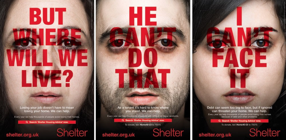
Various different technical codes have been used in this advert to make it its most effective for the reason it has been made. For example the use of direct address targets the audience personally and makes you feel guilt for not helping out. This is assisted with the type of imagery used, the people staring into the camera lens is the reason we are given this direct address, it is less about the text like a usual charity advert and more focused on just the image itself causing the impact it needs. Although we do still see a small out of typography, still following shelters classic red black and white colour scheme they like to do with every advert, the brightness of the red catches the audiences eye as it is very bright and stands out from the rest of the advert. This is still the only bit of colour we see throughout the 3 images, it makes the text more effective for what they're trying to achieve as it catches the eye but still carries the effect of being desaturated and solemn. the representations being created are definitely negative ones, the text saying negative things is a big sign for this. "I cant face it" and "He cant do that" create a almost depressing outlook on how this advert is supposed to be represented although we know that they have done that to try and be real with their audience and show them what it would be like if you were in their shoes and lived their life. The use of using younger people in the campaign goes against the normal stereotypes of what a 'homeless' person looks like. This advert creates more of a social inequality as they are putting a face on who is homeless and who is struggling.
Friday 10th March 2023
Explain who viewpoints and ideologies are communicated by the media language used in adverts. Refer to Old Spice to support your answer.
In the old spice advert there are a great amount of ideologies created through media language. Initially looking at this advert we can see it is very bright and green, this could be to reflect how the product is 'natural' and convey this idea of healthy skin when using their product. This point can be backed up because we see the ambassador is completely shirtless without a single blemish anywhere on his skin, this therefore proves the point more that the use of natural green colours convinces the audience that it is completely natural. It is not just the colours that persuade the audience the audience that it is a natural product. The idea of him being part of the island creates that 'fresh' feeling within the advert, they could have chosen anything and any place to promote this new product but they opted in for the tropical beach and blue waters with exotic animals. We link these things to nature and being pure and completely secluded from all polluted airs and seas.
We also see them trying to sell this product and create ideologies through the used of text and its comedic affect it has on this product. With the mention of the Bahamas twice in the text we can gather that they are attempting to recreate the Bahamas on the ambassadors shoulders but if you do a little bit of research you find out that there are mo volcanoes in the Bahamas yet they have decided to put an active one on the top of his head this could be just a coincidence or they could have planned for this. That is why in the text we see that the scent 'comes from an anti-perspirant mine in the Bahamas' then followed up shortly after by 'this fact has not been fact checked' the use of comedy here is playing on generic stereotypes of mens grooming products as they are usually very serious and try to sell their product in a certain way but old spice have taken that and flipped it on its head. The text could also be a joke on itself because obviously we are aware that there is no such thing as an anti perspirant mine yet they make it believable through the use of obnoxious comedy is starts to get the audience questioning if that is a real thing or not which from a marketing stand point is very good because it means that the buyer/customer is thinking about your design and asking I dont know what im even writing about questions about it getting them included in on this 'joke'.
The characters on the island also give it a little bit of a comedic affect as because of the different outlandish things on there for example old spice have decided to use a mermaid, shark out of water, crab near a mans head in the sand and a chimp throwing either a rock or a coconut. All of these different characters collectively are not usually associated with the calm tropical Bahamas but more of quite the opposite, these are usually linked to a hectic, dangerous island which would not be considered relaxing at all. This reflect back on the brand as it is creating this calm initial feeling but then the more you look the opposite you feel as the audience.


THE BIG ISSUE
Friday 17th March 2023
L/O: To research institutions & ideologies behind case study product


- Masthead (title)
- Selling lines.
- Coverlines.
- Strapline / slogans.
- Price/barcode.
- Cover image/model/celebrity.
Friday 24th March 2023
L/O: To research institutions & ideologies behind case study product
- The big issue was started by John Bird as a response to the increasing numbers of homeless people in London it worked because they provided an opportunity for people to earn their own income.
Wednesday 29th March 2023

The big issue have chosen to use direct address in this particular cover to speak to the audience directly as they are trying to make people aware of a certain thing/situation, which would be her disability that she got in a car crash in 2003 when she was 18. We can tell this by the text and linking that to the main cover image, the fact that she is looking straight at us while saying 'Ive been invisible since I was 18' almost as if she is telling the audience directly. They have also made an effort to make her physically seem bigger in the image as she wants to be seen and they are portraying this in the main image.
Wednesday 19th April 2023


Sorry Jamie - my previous comments seem to have disappeared, but you have done the DIRT work so I'm assuming you saw them!
ReplyDeleteHEAVEN ANALYSIS:
WWW: you clearly understand the themes and ideas behind the song/video
EBI: support your ideas with specific examples from the video (include shot type etc.)
TITANIUM ANALYSIS:
WWW: good intertextuality analysis
EBI: again, you need to back up your ideas with specific examples from the MV.
ADVERT ANALYSIS x2:
WWW: Lynx Advert done well but lacks terminology
EBI: Coke advert missing
OLD SPICE ANALYSIS:
WWW: good use of the analysis techniques with good conclusions
EBI: Terminology - MES, typography, imagery, colour palette etc
LUCOZADE ANALYSIS:
This one seems unfinished
LUCOZADE DIRT:
ReplyDeleteGood identification of some of the media language used but still lacking a detailed analysis of the main elements used - what do these elements, together, connote or represent?
SHELTER ANALYSIS:
WWW: good use of terminology and analysis of the media language
EBI: be more explicit in making links to the overall meaning/purpose of the advert
EXAM PRACTICE Q:
WWW: This is a strong response. Well done. Great use of terminology and clear explanation of how different beliefs and ideologies are constructed.
EBI: don't forget, its a product advert so consumerism etc is almost inherent.